Histograms in Matplotlib
Categories: matplotlib
A bar chart tells us the temperature for each day of the year. Histograms show a different type of information - they tell us how many days of the year were hot or cold.
In this section, we will see how to:
- Easily create a histogram of the data.
- Control the bins by calculating the histogram ourselves.
Creating a simple histogram
Here is a simple histogram of temperatures in 2009:
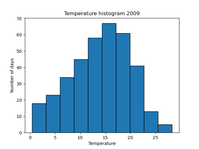
The x position of each bar represents a particular range of temperatures, and the height of the bar indicates how many days of the year fell into that range.
For example, the left-most bar occupies the x range from 0.4 to 3.2 and has a height of 18. This tells us that there were 18 days in the year when the maximum daily temperature was between 0.4 and 3.2 degrees Celsius.
The next bar along has an x range from 3.2 to 6.0, and a height of 23, so we know that 23 days had a maximum temperature between 3.2 and 6.0 degrees.
This histogram doesn't tell us which days were hot or cold. It gives us a good visual indication of the spread of temperatures. We can easily see the most common temperature (the mode), the range of temperatures, and how they are distributed.
Here is the code to create the histogram.
import matplotlib.pyplot as plt
import csv

with open("2009-temp-daily.csv") as csv_file:
    csv_reader = csv.reader(csv_file, quoting=csv.QUOTE_NONNUMERIC)
    temperature = [x[0] for x in csv_reader]

plt.hist(temperature, edgecolor='black')
plt.title("Temperature histogram 2009")
plt.xlabel("Temperature")
plt.ylabel("Number of days")
plt.show()
The code is here on github, in the file histogram_temperatures.py.
The plt.hist function does all the work here. We simply pass it the list of temperature data, and it will calculate a histogram for us.
We have added an edgecolor parameter to create a black outline around the bars of the histogram. This is optional, but it makes it clearer where the boundaries are.
Getting the histogram values
You might be wondering, how can we tell that the first bar occupies the x range 0.4 to 3.2? We could try guessing, or measuring the graph, but there is an easier way. The plt.hist returns the values for us:
n, bins, patches = plt.hist(temperature, edgecolor='black')
The plt.hist function finds the minimum and maximum temperature, and by default splits that range into 10 equal parts (called 'bins').
bins is an array containing the boundaries between the bins. In our case it contains the values:
[ 0.4, 3.19, 5.98, 8.77, 11.56, 14.35, 17.14, 19.93, 22.72, 25.51, 28.3 ]
This tells us that the first bin is the range 0.4 to 3.19, the second bin covers the range 3.19 to 5.98, and so on. Since there are 10 bins, this array contains 11 values.
The bins are calculated by finding the minimum temperature (0.4) and the maximum temperature (28.3) and dividing the total range into 10 equal bins. That gives a total range of 27.9, which makes each bin 2.79 wide.
n is an array containing the counts for each bin, It contains the following values:
[18, 23, 34, 45, 58, 67, 61, 41, 13, 5]
Controlling the histogram bins
The plot above is great for getting an idea of the shape of the histogram, but sometimes it is useful to have more control over the bins. For example, we might like to use bin values such as 0-5, 5-10, 10-25 etc.
There are several ways to do this, but the easiest is to calculate the histogram in our own code, then use a bar chart to display the result.
Here is how to calculate the histogram:
n = [0]*6

for x in temperature:
    bin_id = int(x//5)
    n[bin_id] += 1
We are going to divide the range 0 to 30 into 6 bins, each of width 5 degrees. So we start by creating n, a list of size zeroes.
Next, we loop over every temperature entry. We do an integer division so that values in the range [0, 5) map onto bin 0, [5, 10) map onto bin 1, etc. We then increment the value of the corresponding element in n. By the end of the loop each element in n holds the total count of days that fall into that bin.
Here is the full code:
import matplotlib.pyplot as plt
import csv

with open("2009-temp-daily.csv") as csv_file:
    csv_reader = csv.reader(csv_file, quoting=csv.QUOTE_NONNUMERIC)
    temperature = [x[0] for x in csv_reader]

n = [0]*6

for x in temperature:
    bin_id = int(x//5)
    n[bin_id] += 1

centres = [i*5 + 2.5 for i in range(6)]

plt.bar(centres, n, 5, edgecolor='black')
plt.title("Temperature histogram 2009")
plt.xlabel("Temperature")
plt.ylabel("Number of days")
plt.show()
The code is here on github, in the file histogram_temperatures_bins.py.
The centres list is set up with the centre x position of each band (2.5, 7.5, 12.5 ...).
We use plt.bar to plot the n values using these centre positions, with a bar width of 5.
Here is the histogram:
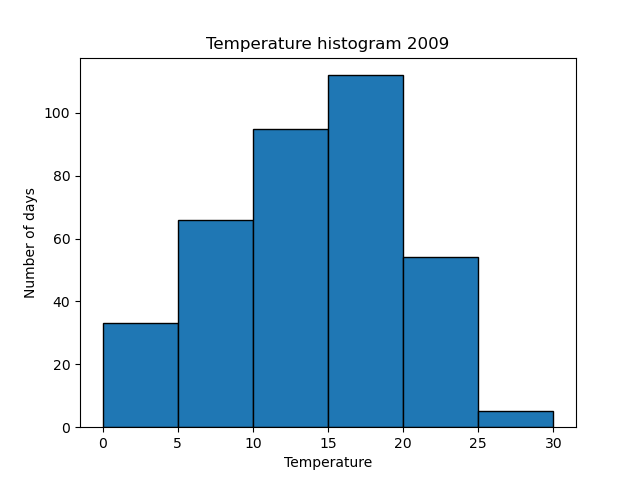
It has a similar basic shape to the previous graph, but it is easier to see exactly which range each bar relates to, as the ranges are all multiples of 5.
Related articles
Join the GraphicMaths/PythonInformer Newsletter
Sign up using this form to receive an email when new content is added to the graphpicmaths or pythoninformer websites:
Popular tags
2d arrays abstract data type and angle animation arc array arrays bar chart bar style behavioural pattern bezier curve built-in function callable object chain circle classes close closure cmyk colour combinations comparison operator context context manager conversion count creational pattern data science data types decorator design pattern device space dictionary drawing duck typing efficiency ellipse else encryption enumerate fill filter for loop formula function function composition function plot functools game development generativepy tutorial generator geometry gif global variable greyscale higher order function hsl html image image processing imagesurface immutable object in operator index inner function input installing integer iter iterable iterator itertools join l system lambda function latex len lerp line line plot line style linear gradient linspace list list comprehension logical operator lru_cache magic method mandelbrot mandelbrot set map marker style matplotlib monad mutability named parameter numeric python numpy object open operator optimisation optional parameter or pandas path pattern permutations pie chart pil pillow polygon pong positional parameter print product programming paradigms programming techniques pure function python standard library range recipes rectangle recursion regular polygon repeat rgb rotation roundrect scaling scatter plot scipy sector segment sequence setup shape singleton slicing sound spirograph sprite square str stream string stroke structural pattern symmetric encryption template tex text tinkerbell fractal transform translation transparency triangle truthy value tuple turtle unpacking user space vectorisation webserver website while loop zip zip_longest