Pie charts in Matplotlib
Categories: matplotlib numpy
In this article, we will look at pie charts. A pie chart is used to compare the relative sizes of discrete categories, as a proportion of the total.
A pie chart represents the entire data set as a circle and shows each category as a pie slice. The angle of each slice (and therefore the area of each slice) represents the relative size of the category.
We will look at:
- A simple pie chart.
- "Exploding" a segment to highlight it.
- Various ways to style a pie chart.
- Donut charts.
- Nested donut charts.
Simple pie chart
Here is the code to create a simple pie chart:
import matplotlib.pyplot as plt

v = [2, 5, 3, 1, 4]
labels = ["A", "B", "C", "D", "E"]

plt.pie(v, labels=labels)
plt.show()
This code is available on github as piechart.py.
Here is the result:
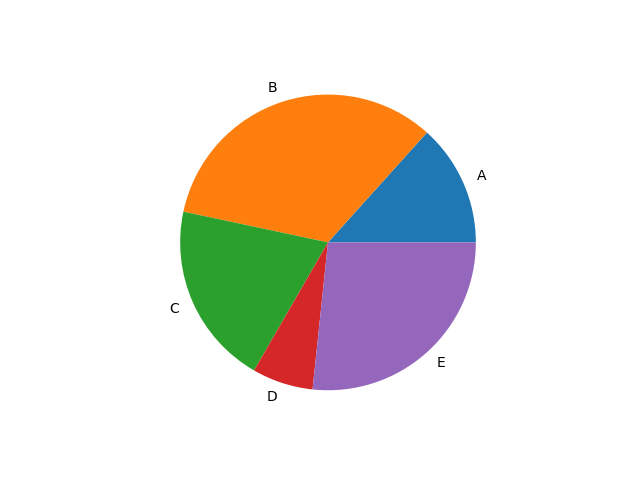
We first create some artificial data, and a set of labels:
v = [2, 5, 3, 1, 4]
labels = ["A", "B", "C", "D", "E"]
The data v is just some random numbers for illustration. The labels list names the category of each data item, we have just used letters but you would normally pick names that relate to the data.
We create the chart using plt.pie:
plt.pie(v, labels=labels)
plt.savefig("piechart.png")
plt.show()
This creates a pie chart using all the default options. This is great if you just want to see the data, without being too worried about which colours, fonts, or other styling is applied. We will see later how to control these things if you need to.
plt.savefig saves the plot as a PNG image file. plt.show displays the plot in a popup window. We have shown both methods here, but you would usually only do one or the other.
Exploding segments
Exploding a segment isn't quite as dramatic as it sounds. It is Matplotlib terminology for displacing one of the segments away from the centre to draw attention to it.
Here is the effect:
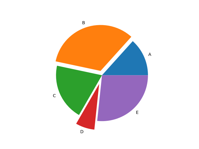
In this example, we have exploded segments B and D, by different amounts. Here is the code to do this:
import matplotlib.pyplot as plt

v = [2, 5, 3, 1, 4]
labels = ["A", "B", "C", "D", "E"]
explode = [0, 0.1, 0, 0.2, 0]

plt.pie(v, labels=labels, explode=explode)
plt.show()
This code is available on github as piechart-explode.py.
We create a pie chart using similar code to the basic example, but with the addition of a new list, explode:
explode = [0, 0.1, 0, 0.2, 0]
This list as one element per segment. The value indicates the offset of each segment from the centre of the circle. It is expressed as a fraction of the circle radius, so:
- The second element (B) is displaced by 0.1, which means the displacement is a tenth of the circle radius.
- The fourth element (D) is displaced by 0.2, which means the displacement is a fifth of the circle radius.
- The other elements are displaced by 0, so they appear at the centre.
Styling pie charts
This example shows several ways to style your chart:
import matplotlib.pyplot as plt

v = [2, 5, 3, 1, 4]
labels = ["A", "B", "C", "D", "E"]
colors = ["#1abc9c", "#2c3e50", "#e67e22", "#8e44ad", "#c0392b"]
explode = [0, 0, 0.1, 0, 0]
wedge_properties = {"edgecolor":"k",'linewidth': 2}

plt.pie(v, labels=labels, explode=explode, colors=colors, startangle=30,
           counterclock=False, shadow=True, wedgeprops=wedge_properties,
           autopct="%1.1f%%", pctdistance=0.7)
plt.title("Color pie chart")
plt.show()
This code is available on github as piechart-styling.py.
Here is the plot:
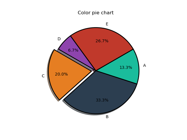
This illustrates several styling features:
- colors - the
colorslist contains 5 different colours, defined using RGB hex format. We pass this list intoplt.pieas thecolorparameter. It controls the colours of the 5 segments of the chart. - startangle - by default, the first segment starts at angle 0 (horizontal right to left, like the x-axis on a graph). The
startangleparameter ofplt.pierotates the whole chart by the specified number of degrees in the counterclockwise direction. See the diagram below. - counterclock - normally the segments are added to the pie chart in the counterclockwise direction. If the
counterclockparameter ofplt.pieis set false, the segments are added in the clockwise direction instead. See the diagram below. - shadow - if this parameter of
plt.pieis true, a shadow effect is added under the pie. It isn't a particularly good effect, you can't change the colour or direction of the shadow and it doesn't have the option to fade at the edge, but it is available if you want to use it. - wedgeprops - this can be used to control various aspects of the segment appearance, via a dictionary (
wedge_properties) passed in as thewedgepropsparameter. We have created a dictionary with anedgecolorof"k"(ie black) and alinewidthof 2 (pixels), so each segment is outlined in black. For other options, see the Matplotlib documentation. - Percentage labels - we can add labels to the segments indicating the actual percentage that the segment represents. To do this we must set the
autopctparameter ofplt.pieto show the format. For example"%1.1f%%"gives the percentage to 1 decimal place (eg segment A occupies 13.3% of the total). Thepctdistanceparameter controls the position of the percentage labels. It controls the distance of the labels from the centre, as a fraction of the pie radius, in a similar way to theexplodeparameter. A value of 0.7 is a reasonable place to start, but you can experiment. - title - we have added a title to the plot, y calling
plt.title.
This diagram shows how the angles work in more detail:
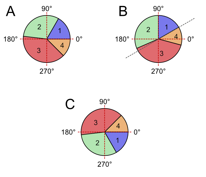
Case A shows the default case. Starting from angle 0, the segments 1 to 4 are added in the counterclockwise direction.
Case B shows the startangle case. It is like case A except the whole pie is rotated counterclockwise by the start angle (which is 30 degrees in the example).
Case C shows the counterclock case. It is like case A except that, starting from angle 0, the segments 1 to 4 are added in the clockwise direction.
Donut charts
A donut chart is a slightly different style of pie chart, using a ring rather than a circle:
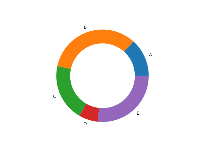
import matplotlib.pyplot as plt

v1 = [2, 5, 3, 1, 4]
labels1 = ["A", "B", "C", "D", "E"]
width = 0.3
wedge_properties = {"width":width}

plt.pie(v1, labels=labels1, wedgeprops=wedge_properties)
plt.show()
This code is available on github as piechart-donut.py.
The only change we have made here is to use the wedgeprops to set a width of 0.3.
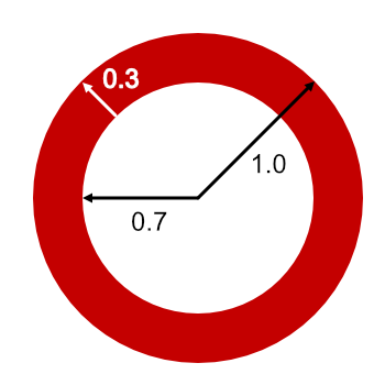
The default radius of the pie is 1, and this forms the outer radius of the donut. Since the donut has a width of 0.3, this makes the inner radius 0.7, like this:
Nested donut charts
One advantage of donuts charts is that we can nest them, to show more than one data set. For example, this one shows two different sets, A to E and V to X:
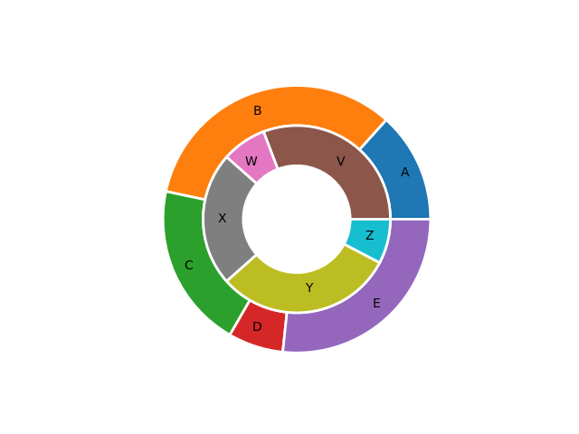
import matplotlib.pyplot as plt

v1 = [2, 5, 3, 1, 4]
labels1 = ["A", "B", "C", "D", "E"]
v2 = [4, 1, 3, 4, 1]
labels2 = ["V", "W", "X", "Y", "Z"]
width = 0.3
wedge_properties = {"width":width, "edgecolor":"w",'linewidth': 2}

plt.pie(v1, labels=labels1, labeldistance=0.85,
        wedgeprops=wedge_properties)
plt.pie(v2, labels=labels2, labeldistance=0.75,
        radius=1-width, wedgeprops=wedge_properties)
plt.show()
This code is available on github as piechart-nested.py.
The main difference to the previous donut example, of course, is that we have defined two sets of values (v1 and v2), two sets of labels (label1 and label2), and called plt.pie twice to plt the two donuts.
There is one more thing we needed to do. The second donut has to be inside the first donut. We achieve this we simply need to set the radius of the pie, in the second call to plt.pie. We set it to 1 - width, which is 0.7.
We have also made a couple of cosmetic changes. First, we have moved the labels (A, B, C etc) inside the segments, to make it clearer which segment they belong to. We do this by setting the labeldistance to a value of slightly less than 1. This parameter works similarly to pctdistance that we used earlier to position the percentage markers. The exact values you use might require a bit of tinkering, depending on the width you decide to use for the donut.
In addition, we have outlined the segments, to make them a bit clearer. We have outlined them in white (by setting edgecolor to "w" and linewidth to 2 in wedgeprops). The white outline makes the segments appear to be slightly separated (because the background colour is white), which is quite a nice effect. Of course, you can use black or any other colour if you prefer.
Summary
As with many Matplotlib plots, it is very easy to create a simple pie chart. In this article, we have also seen that there are many ways to customise pie charts using a few extra lines of code.
Related articles
Join the GraphicMaths/PythonInformer Newsletter
Sign up using this form to receive an email when new content is added to the graphpicmaths or pythoninformer websites:
Popular tags
2d arrays abstract data type and angle animation arc array arrays bar chart bar style behavioural pattern bezier curve built-in function callable object chain circle classes close closure cmyk colour combinations comparison operator context context manager conversion count creational pattern data science data types decorator design pattern device space dictionary drawing duck typing efficiency ellipse else encryption enumerate fill filter for loop formula function function composition function plot functools game development generativepy tutorial generator geometry gif global variable greyscale higher order function hsl html image image processing imagesurface immutable object in operator index inner function input installing integer iter iterable iterator itertools join l system lambda function latex len lerp line line plot line style linear gradient linspace list list comprehension logical operator lru_cache magic method mandelbrot mandelbrot set map marker style matplotlib monad mutability named parameter numeric python numpy object open operator optimisation optional parameter or pandas path pattern permutations pie chart pil pillow polygon pong positional parameter print product programming paradigms programming techniques pure function python standard library range recipes rectangle recursion regular polygon repeat rgb rotation roundrect scaling scatter plot scipy sector segment sequence setup shape singleton slicing sound spirograph sprite square str stream string stroke structural pattern symmetric encryption template tex text tinkerbell fractal transform translation transparency triangle truthy value tuple turtle unpacking user space vectorisation webserver website while loop zip zip_longest