Creating simple plots with Matplotlib
Categories: matplotlib
The simplest way to create a plot in Matplotlib is to use a list of x values and a list of y values:
xa = [0, 1, 2, 3]
ya = [1, 3, 2, 5]
We take each pair of (x, y) values in turn. For example, the first x value is 0, the first y value is 1, so the first point is (0, 1). The next point is (1, 3) etc. The complete data set is interpreted as a set of points (0, 1), (1, 3), (2, 2) and (3, 5).
Here is the full code for plotting this data as a line plot:
from matplotlib import pyplot as plt

xa = [0, 1, 2, 3]
ya = [1, 3, 2, 5]

plt.plot(xa, ya)
plt.show()
That is all we need. We import matplotlib.pyplot, shortening the name to plt (this is quite a common thing to do, you will see it frequently in Matplotlib code). Then we plot the data, and show it, which opens a window to display the plot.
Here is the output:

As you can see, the graph passes through the points (0, 1), (1, 3), (2, 2) and (3, 5), drawing straight lines between them.
The range of the axes, the colour of the plot, the overall size of the graph, and every other aspect of the plot are set automatically by Matplotlib. This makes it very easy to create a quick graph to look at some data. If you need a graph to include in a document, or on a web page, you might want more control - everything is possible, we will look at that in a later article.
Plotting a mathematical function
What if we wanted to plot a maths function, for example
$${e^{-x/4}} {\sin x}$$
We do this in a similar way, by calculating a set of points on the curve. However, we usually calculate a larger number of points, very close together. When these points are joined with straight lines, it gives the illusion of a curve.
In this case, we will plots the graph over values of x from 0 to 12, and we will plot 100 points to give a smooth-looking curve (you can experiment with this, but 100 is a good starting point). Here is how we create the list of x values:
for i in range(100):
    xa.append(i*12/100)
This code creates 100 x values in the range 0 to (just less than) 12.
We can now calculate the y values like this:
for x in xa:
    ya.append(math.sin(x)*math.exp(-x/4))
The full code to calculate and plot the curve looks like this:
from matplotlib import pyplot as plt
import math

xa = []
ya = []

for i in range(100):
    xa.append(i*12/100)

for x in xa:
    ya.append(math.sin(x)*math.exp(-x/4))

plt.plot(xa, ya)
plt.show()
Here is the output:
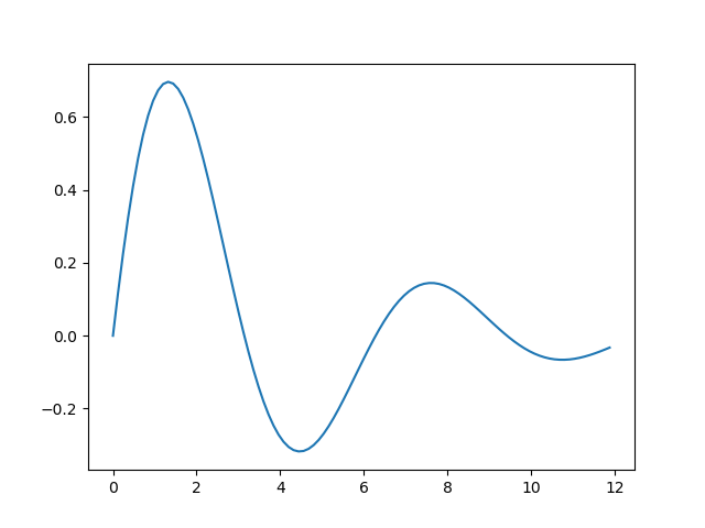
We will see in the next article how to use NumPy to do this in less code.
The code for this section is available on github as simple-list.py and simple-function.py.
Related articles
Join the GraphicMaths/PythonInformer Newsletter
Sign up using this form to receive an email when new content is added to the graphpicmaths or pythoninformer websites:
Popular tags
2d arrays abstract data type and angle animation arc array arrays bar chart bar style behavioural pattern bezier curve built-in function callable object chain circle classes close closure cmyk colour combinations comparison operator context context manager conversion count creational pattern data science data types decorator design pattern device space dictionary drawing duck typing efficiency ellipse else encryption enumerate fill filter for loop formula function function composition function plot functools game development generativepy tutorial generator geometry gif global variable greyscale higher order function hsl html image image processing imagesurface immutable object in operator index inner function input installing integer iter iterable iterator itertools join l system lambda function latex len lerp line line plot line style linear gradient linspace list list comprehension logical operator lru_cache magic method mandelbrot mandelbrot set map marker style matplotlib monad mutability named parameter numeric python numpy object open operator optimisation optional parameter or pandas path pattern permutations pie chart pil pillow polygon pong positional parameter print product programming paradigms programming techniques pure function python standard library range recipes rectangle recursion regular polygon repeat rgb rotation roundrect scaling scatter plot scipy sector segment sequence setup shape singleton slicing sound spirograph sprite square str stream string stroke structural pattern symmetric encryption template tex text tinkerbell fractal transform translation transparency triangle truthy value tuple turtle unpacking user space vectorisation webserver website while loop zip zip_longest